Boys & Girls Haven needed a brand refresh and some guidance on making their materials consistent. Their existing logo was working for them, but they needed some collateral as well as some consistent brand elements they could use across their marketing.
- Client Boys & Girls Haven
- Brand Strategy Carrie Scrufari
- Design Carrie Scrufari
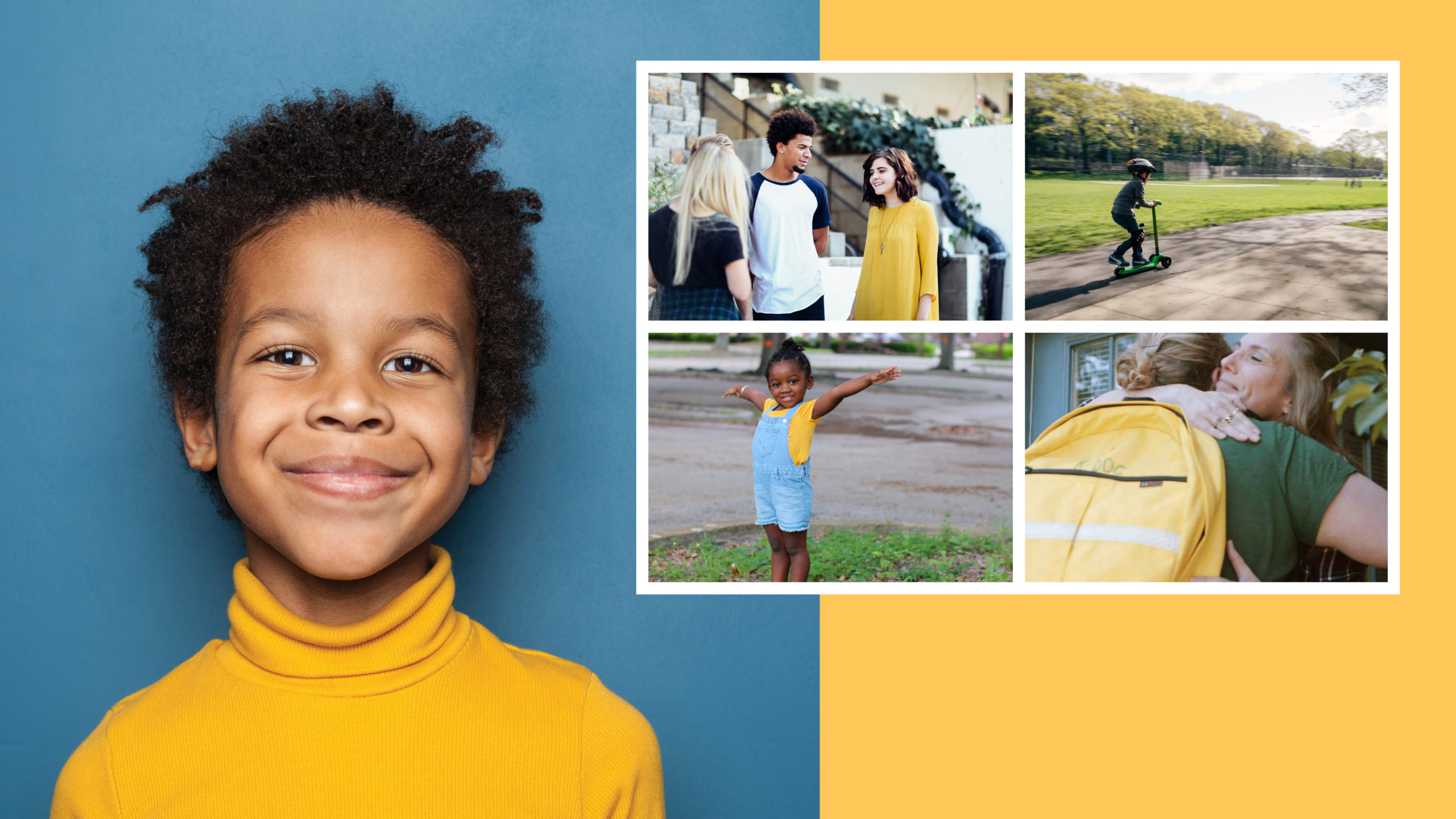
Photography is an important element in Boys & Girls Haven’s refreshed brand identity. Since their mission is to support foster kids, the tone of their photography needed to be optimistic and hopeful, showing the outcomes they seek to achieve for the kids they serve.
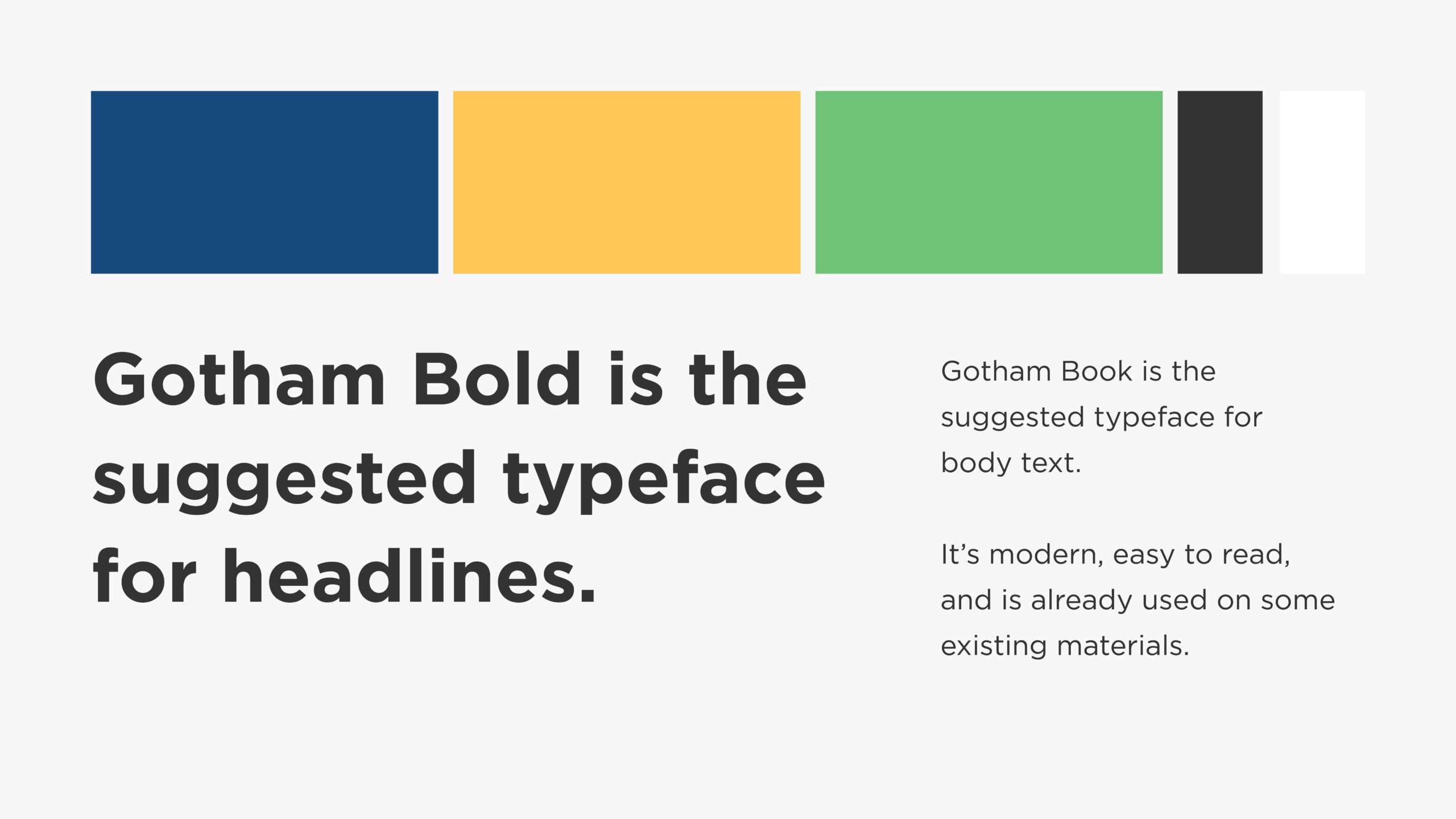
The colors and typography needed to work well with their existing logo as well as evoke the positive, hopeful tone of their brand.

Boys & Girls Haven also needed some brand-forward visual approaches to have in their toolkit. The house shape, pulled from their existing logo, can form a colorful pattern or serve as an enclosing shape for photography.
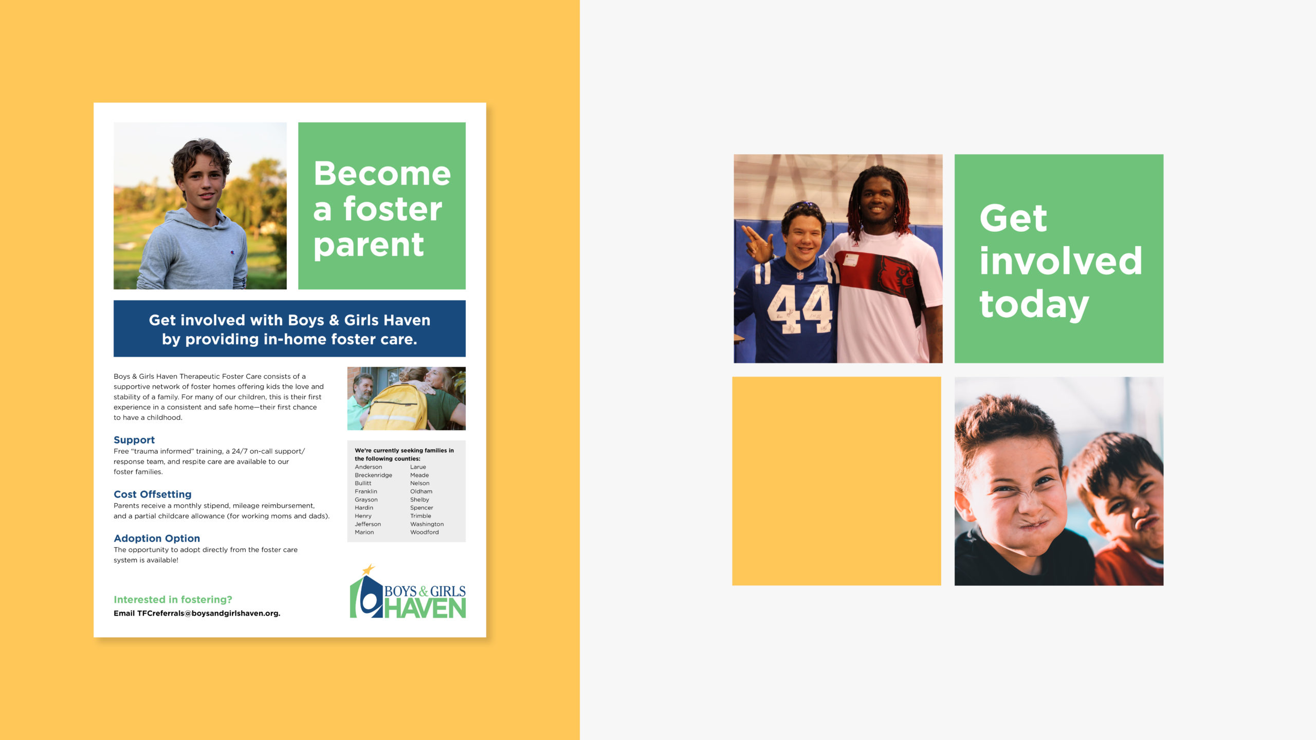
As part of the brand refresh, they also needed simple grid-based layouts that could be easily modified and recreated by their in-house team.
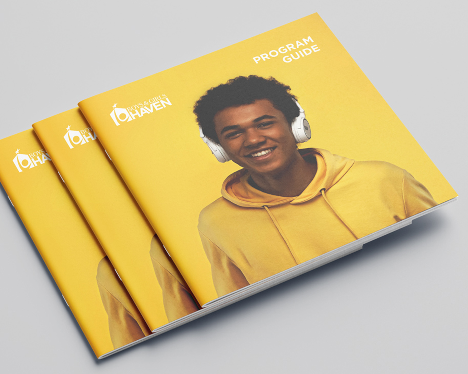
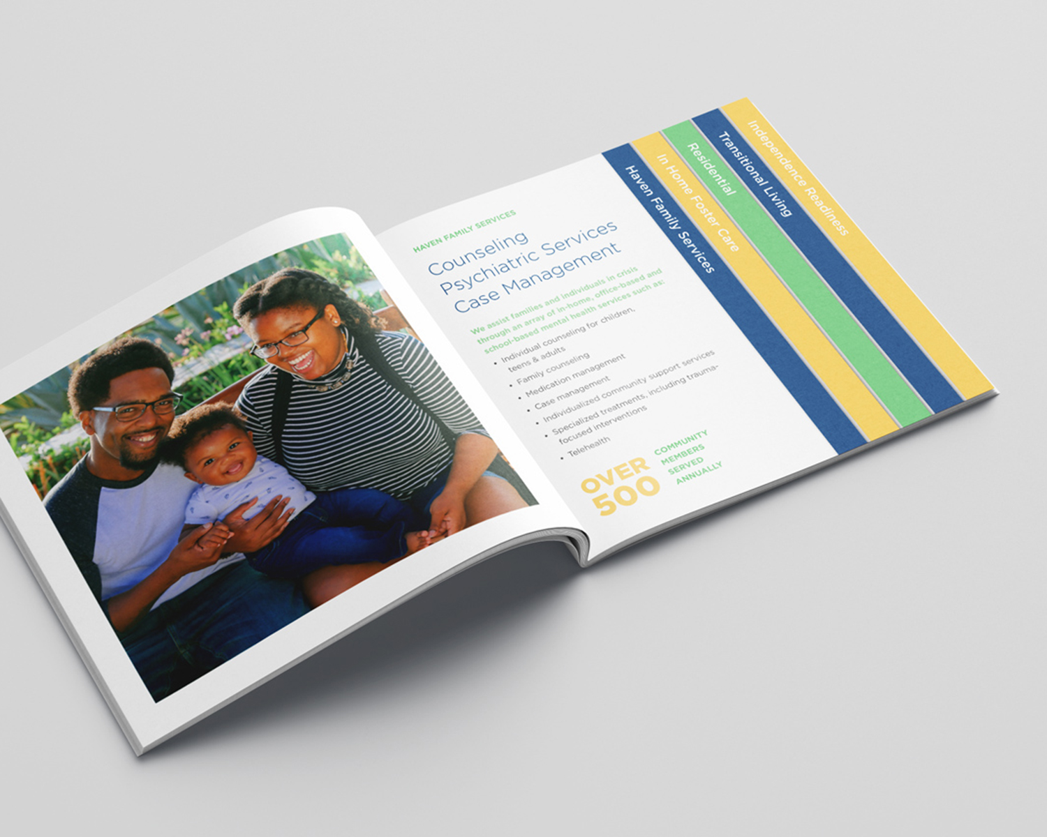
The design for the Boys & Girls Haven program guide leads with bright cutout portraiture of a teenager and uses photography as well as their newly defined typeface and color scheme to give an overview of all that they do.
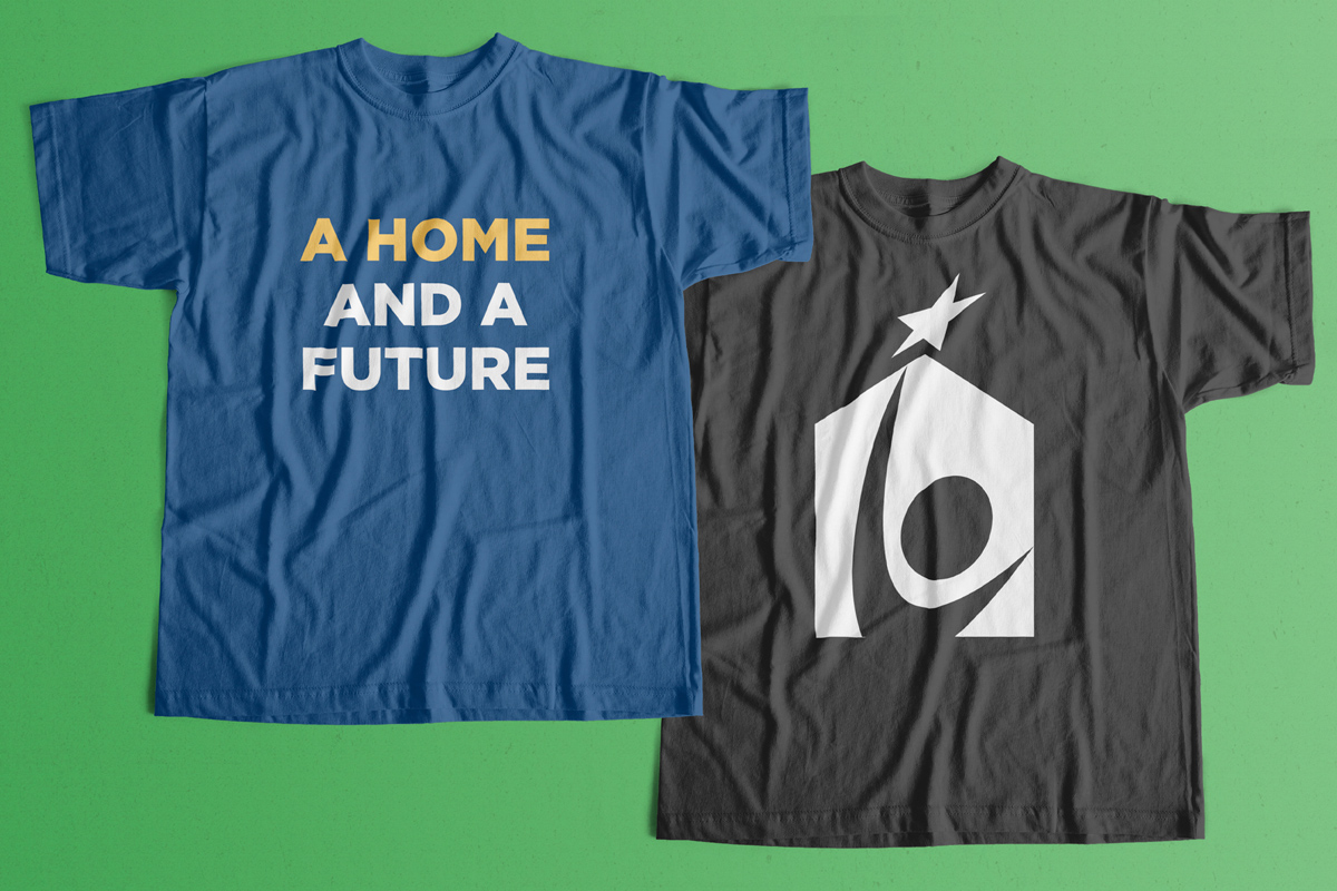
Their brand elements can be expressed in a variety of ways, such as merchandise to promote their mission and tagline.