Extra Mile is a realtor team within EXP Realty that wanted their own brand identity. The goal was to create something eye-catching and unique that also played well with EXP’s logo which needed to be incorporated in some instances.
In collaboration with Toast & Tiger.
- Client Extra Mile Team
- Agency Toast & Tiger
- Creative Direction Hannah Stogsdill
- Design Carrie Scrufari
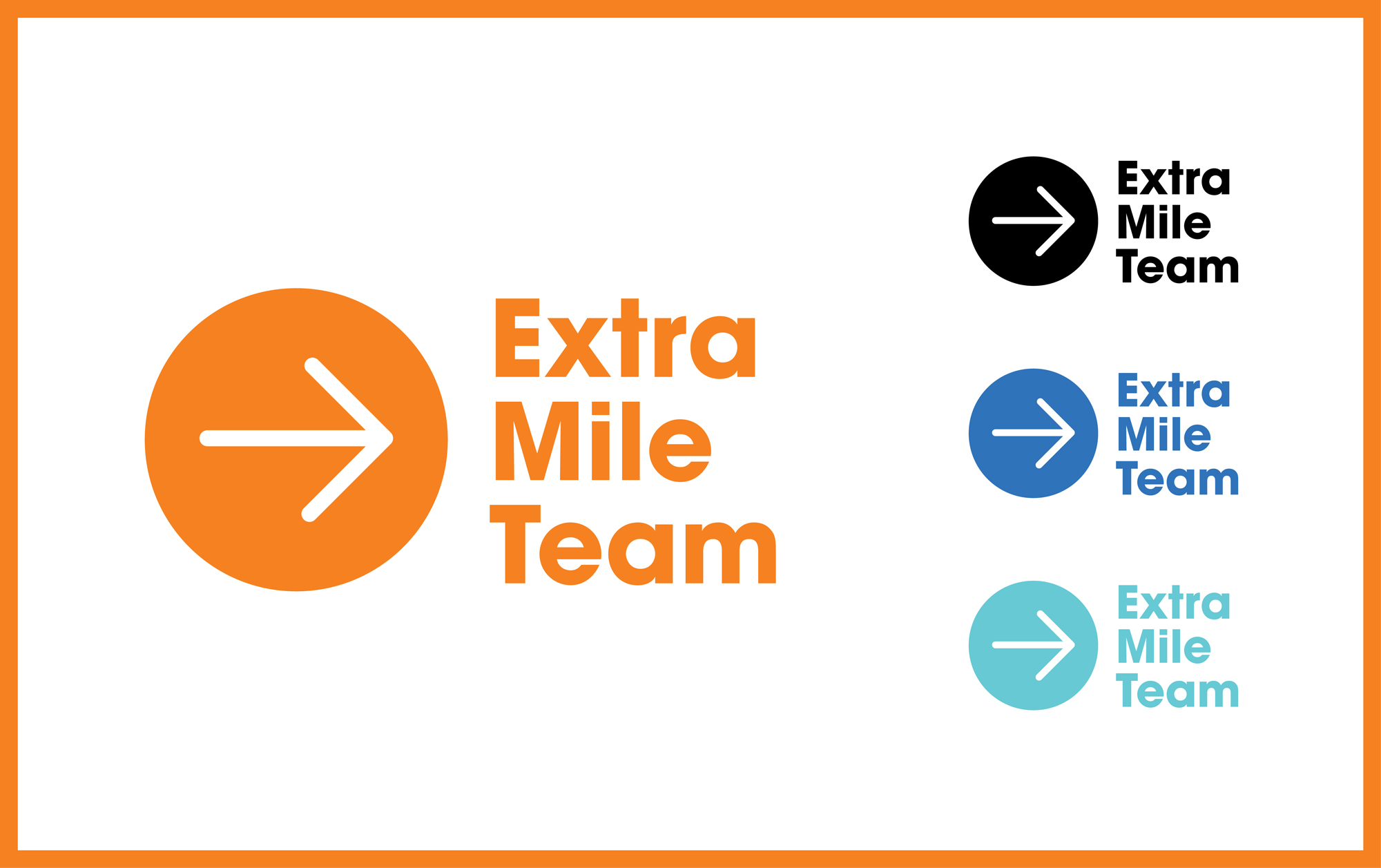
The logo itself is a simple arrow shape in a bold circle, showing the movement of “going the extra mile” and lending itself well to pattern. Orange and royal blue are the primary brand color for Extra Mile (and for EXP).

The arrow shape and colors can form bright and fun patterns that stand against the typical approach to realtor branding.

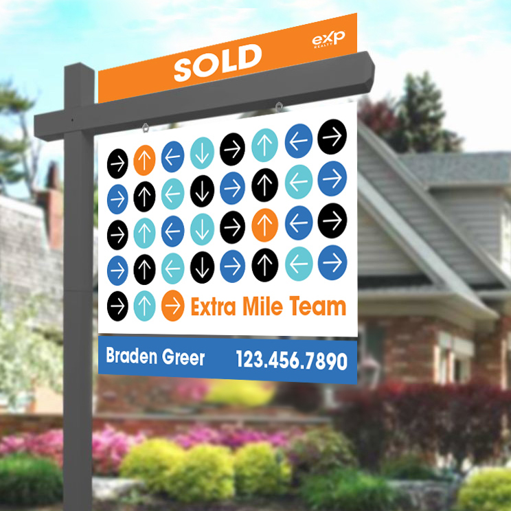
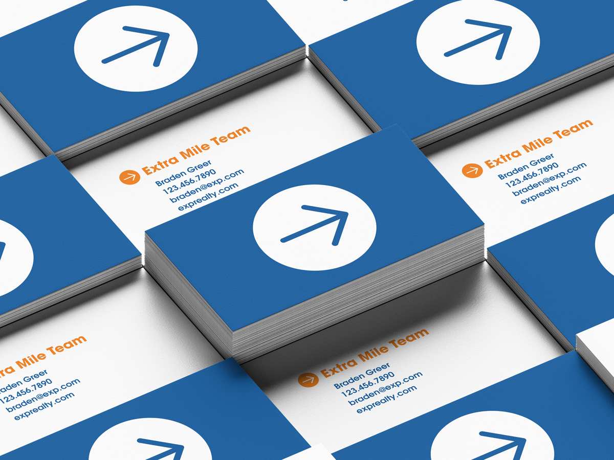
The arrow shape from the logo can be used alone on a business card or in a pattern on a sign.
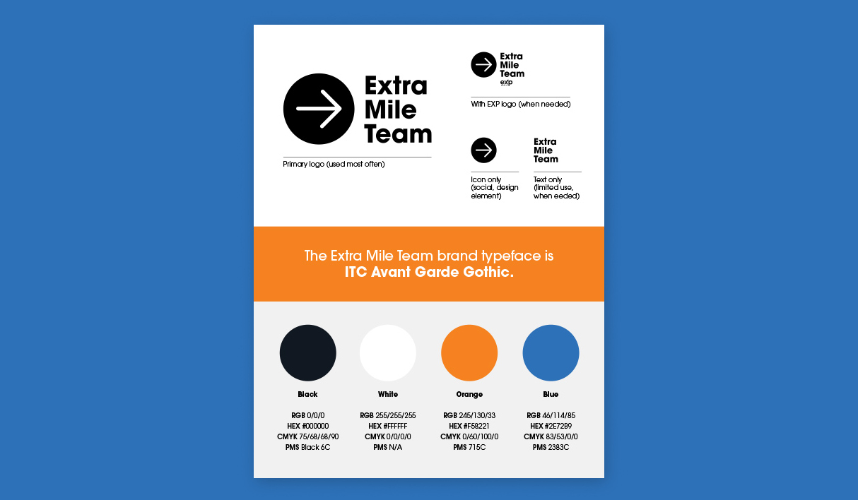
As the final piece of the branding, this one-sheet highlights logo elements, typeface, and colors for future projects.